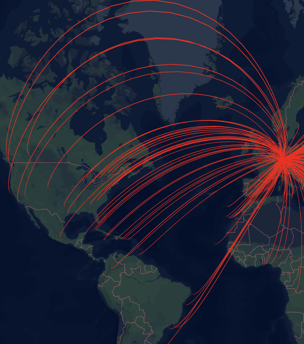
Arc Layer
Arc layers visualize connections between pairs of points on the map, making them ideal for displaying flows, routes, or relationships between locations. Common use cases include visualizing flight paths, trade flows, or migration patterns.
Adding an Arc Layer
- In the Edit Map sidebar, navigate to "Map Layers"
- Click "Add Map Layer"
- Select "Arc Layer" as the layer type
- Configure the data fields (see below)
Configuration
Required Fields
To create an arc layer, you need to specify both origin and destination coordinates:
- Origin Latitude Field: The field containing latitude values for the starting points
- Origin Longitude Field: The field containing longitude values for the starting points
- Destination Latitude Field: The field containing latitude values for the ending points
- Destination Longitude Field: The field containing longitude values for the ending points
Appearance Settings
Width Configuration
Arc width can be configured in two ways:
Static Width: Set a fixed width for all arcs
- Width value (in meters or pixels)
- Unit type (meters or pixels)
- Minimum pixel width (prevents arcs from disappearing when zoomed out)
Data-Driven Width: Scale arc width based on a numeric field
- Select a numeric field to determine width
- Set a scale factor to multiply the field values
- Choose unit type (meters or pixels)
- Set minimum pixel width
Color Configuration
Arcs can be colored in two ways:
Single Color Mode
When "Single Color" is selected, all arcs will be displayed in the same color. You can choose a color using the color picker.
Color Scheme Mode
When "Color Scheme" is selected, arcs will be colored based on a data field using a color gradient or categorical colors.
Options include:
- Color Field: Choose which field to base the colors on
- Continuous fields (numeric data) will create a gradient
- Categorical fields (text data) will assign distinct colors to each category
- Color Scheme: Select from a variety of pre-defined color palettes
- Interpolation Type (for continuous fields only): Choose how to distribute colors across your data
- Value: Colors are distributed evenly across the full range of values
- Quantile: Values are bucketed into equal size groups, then each group is assigned a color
- Custom Discrete: Define your own value ranges and assign specific colors to each range
- Color Steps: Choose how many distinct colors to use in the scheme (3-9 steps)
- Reversed: Toggle to reverse the order of colors in the selected scheme
For detailed information about color schemes, including available palettes and configuration options, see the Color Schemes documentation.
Visibility Settings
- Toggle layer visibility
- Set zoom level range for visibility
- Show/hide layer based on current zoom level
- Useful for performance optimization
Tooltip Settings
Configure what information appears when users interact with arcs:
- Enable Tooltips: Toggle whether tooltips appear on hover
Tooltip Fields
Select which fields from your data appear in tooltips:
- Choose one or more fields to display
- Fields are shown exactly as they exist in the underlying data
Tooltip Number Formatting
Numeric values displayed in tooltips can be formatted for better readability:
- Apply currency, percentage, or compact formatting to tooltip fields
- Add unit labels (e.g., "flights", "km", "/day")
- Configure decimal places and thousands separators
For complete details on formatting options, see Number Formatting.