 Honeycomb Maps Docs
Components
Components sit on top of the map and provide additional information and controls. A title card, charts, and filters are all examples of Honeycomb components.
With components, you can go beyond map layers and provide an interactive map dashboard/app experience to your users that is customized to the data you are displaying.
Available components
| Component Name | Preview | Description | Docs Page |
|---|---|---|---|
| Title Card | 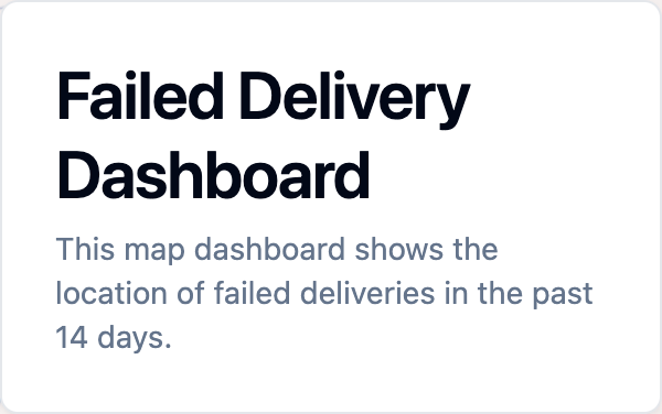 | Shows the map title, subtitle, and optional description. | Title Card Docs |
| Legend | 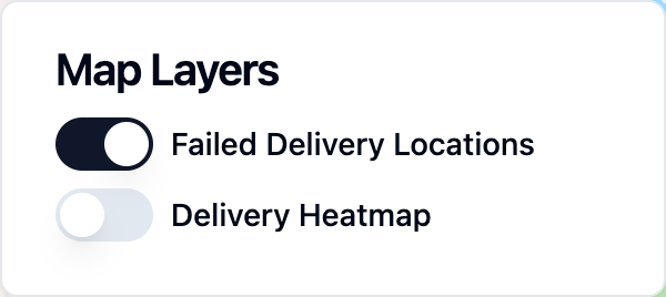 | Shows map layers and visibility controls. | Legend Docs |
| Horizontal Bar Chart |  | Compares aggregated values by category | Horizontal Bar Chart Docs |
| Histogram |  | Displays distribution of numeric data. | Histogram Docs |
| Big Number | 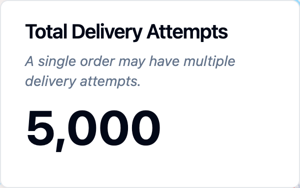 | Shows a single important metric or statistic. | Big Number Docs |
| Filter | 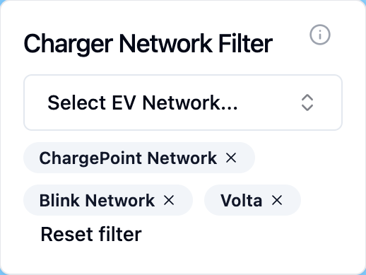 | Allows users to filter data using dropdowns, radio buttons, toggles, or sliders. | Filter Docs |
| Polygon Filter | 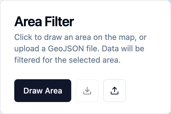 | Lets users draw shapes to filter data within specific areas. | Polygon Filter Docs |