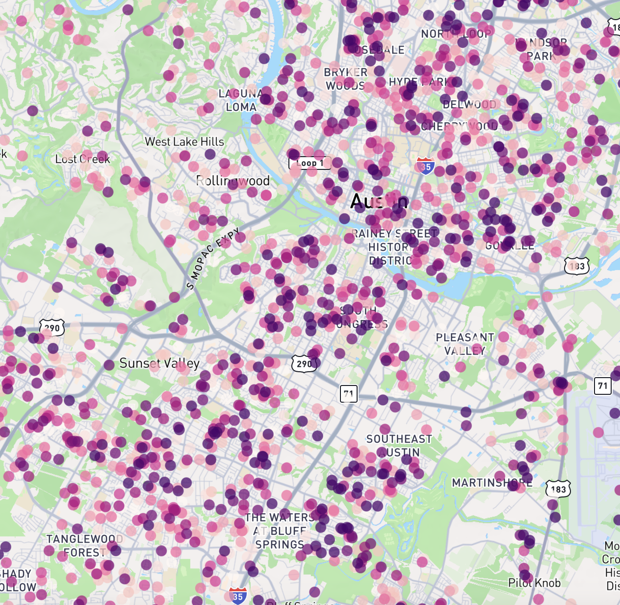
Point Layer
Point layers display individual data points on a map using markers at specific latitude and longitude coordinates.
Configuration Options
Latitude Field
The field from your data source that contains the latitude values. Only numeric fields from your data source will be available for selection.
Longitude Field
The field from your data source that contains the longitude values. Only numeric fields from your data source will be available for selection.
Radius (Meters)
The size of the point markers on the map, specified in meters. You can set this value using either:
- The slider (range: 0-5000 meters)
- Direct input of a specific value (this is not restricted by the slider range)
Radius Min Pixels
The minimum size of point markers in pixels, regardless of zoom level. This is useful for ensuring points remain visible when zoomed out. You can set this value using either:
- The slider (range: 0-100 pixels)
- Direct input of a specific value (this is not restricted by the slider range)
Tooltips
Whether to enable or disable tooltips. Tooltips are displayed when a user hovers their mouse over a point and are useful for showing detailed information about specific points.
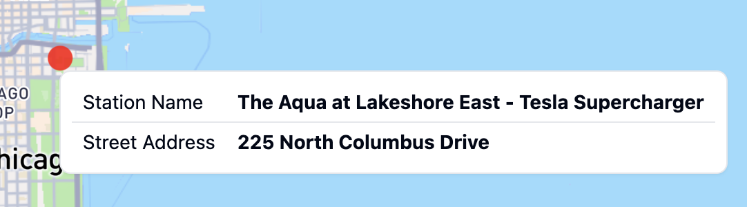
Tooltip Fields
The data fields that will be displayed in the tooltip. Only data fields from the same data source as the layer itself can be displayed in a tooltip. If no data fields are selected, the tooltip will not be displayed.
Color Configuration
Points can be colored in two ways:
Single Color Mode
When "Single Color" is selected, all points will be displayed in the same color. You can choose a color using the color picker
Color Scheme Mode
When "Color Scheme" is selected, points will be colored based on a data field using a color gradient or categorical colors.
Options include:
- Color Field: Choose which field to base the colors on
- Continuous fields (numeric data) will create a gradient
- Categorical fields (text data) will assign distinct colors to each category
- Color Scheme: Select from a variety of pre-defined color palettes
- Interpolation Type (for continuous fields only): Choose how to distribute colors across your data
- Value: Colors are distributed evenly across the full range of values
- Quantile: Values are bucketed into equal size groups, then each group is assigned a color
TIP
If your data has some values of zero and many very large values, all of the large values will appear as the same color using value interpolation. In this case, using quantile distribution will make the differences in values more visible, as the large values will still be grouped into different buckets.
- Color Steps: Choose how many distinct colors to use in the scheme (3-9 steps)
- Reversed: Toggle to reverse the order of colors in the selected scheme. This is useful in cases where lower values are better and you are using diverging color scheme, such as visualizing pollution levels when you want green to be low and red to be high.
For general options that apply to all layer types, such as Layer ID, Label, Visibility, and Opacity, see the Map Layers documentation.